I read an interesting article in the Wall Street Journal about how United Airlines used data about aircraft damage and worker injuries to identify root causes and effect change.
DATA DELIVERS AT UNITED
Since embarking on a data visualization project in 2013, the airline has been able to better analyze its worker injuries and aircraft damage incidents and take steps to reduce them.
23% decline in employee injuries since 2014 across the entire 85,000-member workforce
40% decline in injuries among baggage handlers and ramp workers since 2014
29% decrease in incidents of aircraft damage on the ground since 2014
21% decrease in ground damage to planes so far this year over 2015
20% reduction in employee injuries that result in time off so far this year over 2015
Source: Wall Street Journal article.
The most interesting aspect of the article was the people behind the project and how they executed it. Reading between the lines, a lot of Non-IT types seem to have applied their skills to help perform this analysis. Being in the technology space using cloud computing platforms such as Amazon Web Services (AWS), it is amazing to see how easy it has become to ingest, process and visualize data. The most exciting part is the emergence of easy to use and light weight tools like Tableau, Qlik and others. These tools can be setup quickly and connected with powerful database technologies available as-a-service in the cloud.
The ability to quickly deploy and use powerful analytics tools that can be operated by non-IT users is rapidly enabling powerful use cases as described in the Wall Street Journal article. I am fortunate to be working with savvy business executives who understand the value of data and are brave enough to experiment with new ways of executing IT projects using cloud platforms.
One of our clients’ CFO championed a Data Visualization project for tracking their sales pipeline and quickly discovered issues with the sales projections and probabilities of closing business through a few clicks on a simple dashboard built in 3 days. The same data had been available for years on excel spreadsheets but the ability to quickly visualize and interact with the data was the game changer.
Business intelligence and data analytics have been around for many years and decades – nothing new there – but it is consumerization of complex IT functions that include infrastructure, application software and data management that is enabling new use cases and a whole new community of users.
What are some of the examples you have come across?
Interested in data and enabling innovation in your organization?
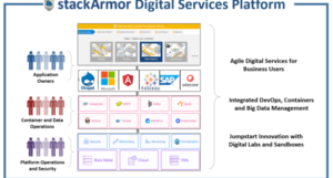
Data Services with DevOps, DataOps, Big Data and Containers
Jumpstart your visualization project with Tableau Dashboard-As-A-Service on AWS